Jack Daniel's Logo
Jack Daniel's is a brand of Tennessee whiskey and the highest selling American whiskey in the world. It is produced in Lynchburg, Tennessee, by the Jack Daniel Distillery, which has been owned by the Brown-Forman Corporation since 1956. Despite being the location of a major operational distillery, Jack Daniel's home county of Moore is a dry county, so the product is not available for consumption at stores or restaurants within the county.
Logo

About Jack Daniel's Logo
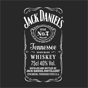
The logo features a predominantly black background with white text and detailing. At the very top is the text "JACK DANIEL'S" in all capital letters, with the font style representing a classic, bold serif typeface. Below this, a decorative border with intricate scroll work and filigree frames the center elements of the logo.
In the middle, there is a key focal point which is a label-style emblem that reads "Old No. 7." The phrase "Old No." is slightly smaller in size, while the "7" is prominently larger and bold, catching immediate attention.
Below the number 7, the word "BRAND" is displayed in a modest-sized, sans-serif font, indicating a subheading or trademark.
At the bottom of the emblem, the phrase "Tennessee Whiskey" is written in a large, flowing script that spans the width of the emblem, serving as the category descriptor for the product.
The entire logo is encompassed within a decorative border that gives the impression of an old-fashioned, ornate frame, which could be reminiscent of the historical and traditional aspects of the brand.
Overall, the logo conveys a sense of tradition, quality, and American heritage associated with the Tennessee whiskey maker.
The Jack Daniel's logo is a food and drink logo made up of around 3 different colors.
The Jack Daniel's logo contains a number of different shapes, including 272 squares, 1 rectangle, 2 pentagons, 53 stars and 237 circles.
We have pulled the following text out of the logo: WHISKEY K M.
The Jack Daniel's logo is made up of a bunch of different colors. These colors include black, teal and silver. Beyond those 3 basic colors there are also 3 more specific colors found, these include black, purplish grey and silver.
The Jack Daniel's logo is a Jack Daniel's, Jack Daniels, Whiskey, Distillery, Food And Drinks, United States, Jack and Daniel's logo.
Jack Daniel's Logo Information and History
The brand design for Jack Daniel's Tennessee Whiskey has recently been updated, thanks to Minneapolis-based brand design company Cue. While the iconic filigree design is still present, the label has also undergone some changes. The inscriptions on the front part of the label have been reduced in length, accentuating the contrasting design of the logo. Overall, the logo is simple, but its unique shape and color scheme are certain to draw attention.
The original Jack Daniels logo has a bottle that looks like it was created by accident. The oval in the logo represents the cork used to keep the whiskey's flavor. The black frame around the emblem is reminiscent of the shape of the bottle. The black color, on the other hand, was chosen as a tribute to the distillery's founder, who died in 1911. Black represents authority, elegance, and wealth.
Jack Daniels's brand is one of the wordiest in the world. Its logo is essentially a collection of inscriptions, with only a decorative oval with a spiral border. However, part of the logo has since disappeared. It once read "Pop. 361." However, this postscript does not reflect the actual population of Lynchburg, Tennessee. Thus, this logo has become one of the most recognizable whiskey brands in the world.
Aside from its famous slogan, the Jack Daniels logo has a number of shapes. The logo contains three squares and a rectangle, as well as five stars and 17 circles. The company's colors are Jack Black, White, Metallic Gold, and Rye Green. The colors are all available on the Jack Daniels website. If you want to use the Jack Daniels logo, it's best to check the company's website for more information.
Basic Colors
We've taken a look at the image and pulled out some colors that are common across lots of logos. The colors below aren't the exact colors found in the image, but approximations to common colors.
Advanced Colors
We've extracted the below 'advanced colors' from the logo. These should be much closer to the actual colors found in the logo. Our extractor tries to only take the main colors of the image and tries to ignore shading on anti-aliasing or shadows. This generally leads to better results, but in some circumstances you might find a few unusual colors being pulled from the logo.
Hex Colors
The below are the hex colors that are found in the logo. You can assume that these are the actual colors used in the logo. Our color extraction tool that takes the colors from the logo tries to ignore anti-aliasing and shadows, so you may sometimes find a slightly odd result, but this is rare. These colors should be very similar to the Advanced Colors, but you'll notice subtle differences. If you're interested in the exact color then use the hex, but if you're trying to describe the logo then use the Advanced Color or the Basic Color above.


