Paw Patrol Logo
Logo
About Paw Patrol Logo
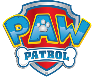
The Paw Patrol logo consists of a stylized shield or badge as the primary shape. The shield has a metallic silver outline with a beveled effect to create a 3-D appearance. The background of the shield is split into three sections: a metallic silver top, followed by a dark blue banner stripe, and then a red field dominating the lower section. The silver top part has a subtle starburst pattern emanating from the center.
Across the top of the shield in the silver section is the text "PAW" in large, bold letters that have a three-dimensional effect. The letters are colored in a gradient of yellow at the top fading into a light blue at the bottom. The letters also have a thick blue outline and a subtle white highlight at the top, giving them a beveled look.
Below, in the dark blue banner, is the text "PATROL" in a similar style to "PAW," with the same color gradient, blue outline, and white highlight effects; however, these letters are slightly smaller. This creates a sense of hierarchy in the logo, emphasizing the word "PAW" over "PATROL."
Surrounding the shield is a thick grey border with a metallic look, and it mimics the shape of the shield but deviates slightly to give a sense of depth, like a shadow or secondary layer behind the main emblem.
The colors and robust design of the logo convey energy
The Paw Patrol logo is a medium logo made up of around 5 different colors.
The Paw Patrol logo contains a number of different shapes, including 17 squares, 1 rectangle, 11 stars and 14 circles.
The Paw Patrol logo is made up of a bunch of different colors. These colors include teal, red and yellow. Beyond those 3 basic colors there are also 5 more specific colors found, these include water blue, cherry red, sunflower yellow, mid blue and squash.
The Paw Patrol logo is a Nickelodeon, Media, Canada, Paw and Patrol logo.
Paw Patrol Logo Information and History
The Paw Patrol logo is the most well-known and iconic symbol of the Canadian animated series. Developed by Keith Chapman in 2013, the show consists of the four lovable pups, Rubble, Chase, Marshall, and Skye. As the show's popularity grew, licensing companies began producing products based on the Paw Patrol characters. And with that growth came the need for a suitable logo to accompany these products. Fortunately, there are several fonts designed to mimic the Paw Patrol logo, including a custom one called Grobold, a TrueType Fancy Cartoon typeface.
The original Paw Patrol logo was created by a group of talented graphic artists and developers, who were charged with incorporating the show's ideas into the logo. Its logo incorporates the paw with a shield to create a symbol that is easily recognizable. The Paw Patrol shield emblem comes in various colors and sizes, with a bone pattern on the interior. The logo is delivered in a 3D frame that gives it the appearance of being made from metal.
The Paw Patrol logo's colors represent energy, happiness, balance, and goodness. They were changed in 2013 and the current color palette is listed below. If you would like to use the logo as a basis for a design project, you can get the color codes by looking at the original Paw Patrol website. The Pantone color codes for the characters are: PMS 7626 C for red, PMS 2925 C for blue, and PMS 107 C for yellow.
Basic Colors
We've taken a look at the image and pulled out some colors that are common across lots of logos. The colors below aren't the exact colors found in the image, but approximations to common colors.
Advanced Colors
We've extracted the below 'advanced colors' from the logo. These should be much closer to the actual colors found in the logo. Our extractor tries to only take the main colors of the image and tries to ignore shading on anti-aliasing or shadows. This generally leads to better results, but in some circumstances you might find a few unusual colors being pulled from the logo.
Hex Colors
The below are the hex colors that are found in the logo. You can assume that these are the actual colors used in the logo. Our color extraction tool that takes the colors from the logo tries to ignore anti-aliasing and shadows, so you may sometimes find a slightly odd result, but this is rare. These colors should be very similar to the Advanced Colors, but you'll notice subtle differences. If you're interested in the exact color then use the hex, but if you're trying to describe the logo then use the Advanced Color or the Basic Color above.
Similar Logos
The following logos are similar to this logo.

Patrulha Canina - Skye
- olive
- fuchsia
- white
- purple
- silver
www.emporio1.com.br www.facebook.com/Emporioum
View Logo
Patrulha Canina - Chase
- blue
- silver
- red
- olive
- navy
www.emporio1.com.br https://www.facebook.com/Emporioum
View Logo
Patrulha Canina - Marshall
- red
- yellow
- maroon
- silver
- teal
www.emporio1.com.br https://www.facebook.com/Emporioum
View Logo
Patrulha Canina - Everest
- purple
- olive
- teal
- silver
- black
www.emporio1.com.br https://www.facebook.com/Emporioum
View Logo
Patrulha Canina - Rubble
- yellow
- olive
- silver
- teal
- red
www.emporio1.com.br https://www.facebook.com/Emporioum
View Logo
Patrulha Canina - Rocky
- lime
- green
- silver
- teal
- purple
www.emporio1.com.br https://www.facebook.com/Emporioum
View Logo
Patrulha Canina - Zuma
- red
- olive
- aqua
- purple
- teal
www.emporio1.com.br https://www.facebook.com/Emporioum
View Logo