20th Television Logo
Logo

About 20th Television Logo
The logo features the text "20th Television" prominently displayed. The design incorporates a bold and modern font, predominantly in white against a black background, creating a strong visual contrast.
The "20th" portion is highlighted with a distinct emphasis on the numeral "20," which is larger in size compared to the rest of the text. It often appears in uppercase letters, conveying a sense of prominence and established presence in the television industry.
The word "Television" is presented in a slightly smaller, yet still bold, font, maintaining the same white color. This part of the logo is typically aligned beneath "20th."
The overall shape of the logo is rectangular, allowing for a compact display that is easily recognizable. The simplicity of the color scheme — black and white — enhances its versatility, making it suitable for various backgrounds in promotional materials.
Overall, the logo exudes a sense of professionalism and legacy, making it easily identifiable among viewers and within the media landscape.
The 20th Television logo is a medium logo made up of around 4 different colors.
The 20th Television logo contains a number of different shapes, including 1 rectangle, 1 star and 1 circle.
The 20th Television logo is made up of a bunch of different colors. These colors include black, silver, white and teal. Beyond those 4 basic colors there are also 4 more specific colors found, these include black, grey, very light pink and charcoal grey.
The 20th Television logo is a Television, Media and 20Th logo.
Advanced colors
Hex colors
Similar Logos
The following logos are similar to this logo.



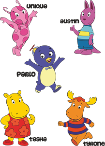
Backyardigans COLOR
- yellow
- olive
- purple
- red
Desenho COLORIDO vetorizado de todos os backyardigans.
View Logo

American Public Television
- black
- white
- purple
- silver
The logo for American Public Television.
View Logo