4 Channel Logo
Old WNBC-TV Logo (1980s)
Logo

About 4 Channel Logo
The logo for "4 Channel" features a clean, modern design primarily using a monochromatic color scheme. Central to the logo is the number "4," which is stylized in a bold, geometric font. The "4" is positioned above the word "Channel," which is presented in a sleek, sans-serif typeface.
The entire logo is designed to convey a sense of technology and innovation, reflecting the company's focus. The number "4" has a unique design, possibly incorporating angles or curves that add dynamism to the overall appearance. The text "Channel" is typically smaller than the "4," providing a sense of hierarchy.
The background of the logo is usually plain, accentuating its simplicity and making the logo versatile for various applications. Overall, the design is minimalistic yet impactful, suitable for branding in modern digital contexts.
The 4 Channel logo is a medium logo made up of around 1 different colors.
The 4 Channel logo is quite a simple logo made up of just one shape, it consists of just 1 rectangle.
The 4 Channel logo is a Television, Media and Channel logo.
Advanced colors
Hex colors
Similar Logos
The following logos are similar to this logo.

News24 Channel
- teal
- red
- navy
- silver
News24 is a Bangladeshi pay television channel. It started operation in 2016. It is located in Bashu...
View Logo



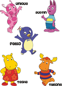
Backyardigans COLOR
- yellow
- olive
- purple
- red
Desenho COLORIDO vetorizado de todos os backyardigans.
View Logo
American Public Television
- black
- white
- purple
- silver
The logo for American Public Television.
View Logo