Al Manar Logo
Logo

About Al Manar Logo
The logo for Al Manar features an intricate geometric design predominantly in a rich gold color. The central element is a stylized "V" shape, which is created by two symmetrical triangular forms pointing downward. These triangles are connected by lines that extend outward, forming a broader, more complex structure resembling wings or an abstract representation of growth and forward movement.
Above the central "V," there is a circular element that is slightly elevated, providing a sense of balance. This circular shape contains a small dot at its center, enhancing the overall visual interest of the design.
Beneath the graphic element, the text "AL-MANAR" is displayed in bold, uppercase letters. The font has a modern look, and it is also rendered in the same gold hue, creating a cohesive and elegant appearance. The text is aligned centrally beneath the logo graphic, further emphasizing the brand's identity.
The overall composition of the logo conveys a sense of sophistication, strength, and modernity, making it easily recognizable and memorable. Its clean lines and striking color create a compelling visual that would stand out in various settings.
The Al Manar logo is a medium logo made up of around 1 different colors.
The Al Manar logo is quite a simple logo made up of just one shape, it consists of just 1 rectangle.
We have pulled the following text out of the logo: XV.
The Al Manar logo is a Al-Manar, Television, Media, Lebanon, Al and Manar logo.
Advanced colors
Hex colors
Similar Logos
The following logos are similar to this logo.


SMP ISLAM AL-MANAR CIBARUSAH
- olive
- navy
- yellow
- silver
- teal
Percetakan Offset & Digital Printing
View Logo
SMK AL-MANAR ISLAMIC SCHOOL
- yellow
- navy
- red
- olive
- black
Percetakan Offset & Digital Printing
View Logo



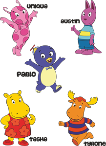
Backyardigans COLOR
- yellow
- olive
- purple
- red
Desenho COLORIDO vetorizado de todos os backyardigans.
View Logo