Anime Series Logo
Logo

About Anime Series Logo
The logo features the company name "Anime Series" prominently displayed. The text is rendered in a bold, stylized font that conveys a sense of energy and dynamism, reflective of the anime genre. The primary color scheme consists of vibrant shades, likely with black and possibly additional colors that enhance its appeal.
The word "Anime" is likely emphasized in a larger or bolder typeface, while "Series" may be positioned directly below it or to the side in a contrasting size or style to create a visual hierarchy. Surrounding the text, there may be graphic elements that resemble stylized anime motifs, such as shapes that suggest movement or action, potentially incorporating curves or angular elements to add depth and excitement.
Overall, the logo is designed to attract fans of anime, drawing attention with its vivid colors and dynamic typography, making it immediately recognizable within the culture. The design effectively balances both artistic flair and clarity, ensuring that the company's focus on anime series is immediately apparent.
The Anime Series logo is a medium logo made up of around 1 different colors.
The Anime Series logo is quite a simple logo made up of just one shape, it consists of just 1 rectangle.
We have pulled the following text out of the logo: IJ I EB.
The Anime Series logo is a Television, Media, Japan, Anime and Series logo.
Advanced colors
Hex colors
Similar Logos
The following logos are similar to this logo.



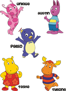
Backyardigans COLOR
- yellow
- olive
- purple
- red
Desenho COLORIDO vetorizado de todos os backyardigans.
View Logo
American Public Television
- black
- white
- purple
- silver
The logo for American Public Television.
View Logo