Aqua Teen Hunger Force Main Logo
The main Screwballs in the hit Adult Swim Show
Logo

About Aqua Teen Hunger Force Main Logo
The logo features three distinct cartoon characters positioned against a muted green background. On the left, there is a white cup resembling a soft drink container, complete with a pink bendy straw. The cup has large, expressive eyes that give it a somewhat puzzled or surprised demeanor, with small yellow arms extending from its sides.
In the center, the second character is a stylized red container of French fries. The fries appear to protrude from the top, resembling spiky yellow shapes. This character displays a confident smirk, accentuated by a thick black goatee and sharp eyebrows, conveying a mischievous personality.
On the right, the third character is a round, fluffy red figure with a friendly appearance. It has wide, happy eyes and a slight smile, capturing a playful vibe. The character also features small, light blue highlights, adding to its cartoonish charm.
Overall, the logo is vibrant and playful, characterized by bold colors like red, white, yellow, and pink, which create a fun and engaging visual identity for the brand.
The Aqua Teen Hunger Force Main logo is a medium logo made up of around 5 different colors.
The Aqua Teen Hunger Force Main logo contains a number of different shapes, including 1 triangle, 6 squares, 1 rectangle, 2 stars and 20 circles.
The Aqua Teen Hunger Force Main logo is made up of a bunch of different colors. These colors include silver, red, yellow, maroon and purple. Beyond those 5 basic colors there are also 5 more specific colors found, these include greenish tan, cherry red, squash, red brown and dark hot pink.
The Aqua Teen Hunger Force Main logo is a Television, Media, United States, Aqua, Teen, Hunger, Force and Main logo.
Basic colors
Approximations to common color names. How we pick the colors →
Advanced colors
Hex colors
Similar Logos
The following logos are similar to this logo.



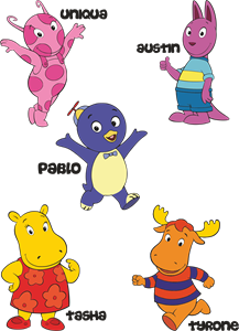
Backyardigans COLOR
- yellow
- olive
- purple
- red
Desenho COLORIDO vetorizado de todos os backyardigans.
View Logo

American Public Television
- black
- white
- purple
- silver
The logo for American Public Television.
View Logo