Asianet Plus Logo
A T V Channel under asianetindia.com
Logo

About Asianet Plus Logo
The logo features a distinctive triangular design made up of diagonal stripes. The triangle is composed of alternating blue and red stripes, creating a dynamic visual effect. The top section of the triangle contains a series of blue stripes arranged in a descending order, while the lower section transitions to red stripes that are also arranged in a descending pattern.
At the base of the triangle, the word "PLUS" is prominently displayed in bold, stylized letters. The lettering is in a contrasting color, likely white, which stands out against the blue and red background. The overall design conveys a sense of structure and modernity, making it visually appealing and memorable.
The use of colors—such as deep blue and vibrant red—adds to the logo’s energy, embodying a sense of innovation and professionalism. The geometric shapes and clean lines suggest a forward-thinking company, reinforcing the brand's identity.
The Asianet Plus logo is a medium logo made up of around 3 different colors.
The Asianet Plus logo is quite a simple logo made up of just one shape, it consists of just 1 rectangle.
The Asianet Plus logo is made up of a bunch of different colors. These colors include navy, red and purple. Beyond those 3 basic colors there are also 3 more specific colors found, these include cobalt, cherry red and light burgundy.
The Asianet Plus logo is a Television, Media, India, Asianet and Plus logo.
Advanced colors
Hex colors
Similar Logos
The following logos are similar to this logo.



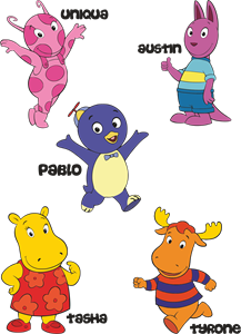
Backyardigans COLOR
- yellow
- olive
- purple
- red
Desenho COLORIDO vetorizado de todos os backyardigans.
View Logo

American Public Television
- black
- white
- purple
- silver
The logo for American Public Television.
View Logo