AVRO Logo
Dutch TV
Logo

About AVRO Logo
The logo features a modern and simplified design for the company "Avro." The centerpiece of the logo is the stylized uppercase letter "A," which takes on a unique arching form, positioned prominently to the left. This letter is depicted in a vibrant shade of blue, conveying a sense of trust and professionalism.
Adjacent to the "A" is the rest of the company name, "vro," which is rendered in a sleek, lowercase font. The text is also in the same blue hue, ensuring visual consistency throughout the logo. The letters are clean and contemporary, contributing to an overall minimalist aesthetic.
The design incorporates a subtle curve within the "A," reminiscent of a half-circle or arch, evoking feelings of innovation and forward-thinking. The logo's layout is balanced, with the graphic element of the "A" harmonizing well with the textual component.
Overall, the Avro logo is characterized by its clean lines, cohesive color palette, and modern typography, making it distinctive and easily recognizable.
The AVRO logo is a medium logo made up of around 1 different colors.
The AVRO logo is quite a simple logo made up of just one shape, it consists of just 1 rectangle.
The AVRO logo is a Avro, Television, Media and Netherlands logo.
Advanced colors
Hex colors
Similar Logos
The following logos are similar to this logo.

Avro Atlantik Merkez
- teal
- silver
Logo of Euro Atlantic Center designed by master M studio. Contacts: e-mail: [email protected]
View Logo


Backyardigans COLOR
- yellow
- olive
- purple
- red
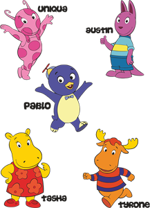
Desenho COLORIDO vetorizado de todos os backyardigans.
View Logo
American Public Television
- black
- white
- purple
- silver
The logo for American Public Television.
View Logo