Brozo Mexico Logo
programa de television mexicana
Logo

About Brozo Mexico Logo
The logo features the company name "Brozo Mexico" displayed prominently. The text "Brozo" is stylized in a bold, modern font, which gives it a strong and dynamic appearance. The color scheme primarily consists of black and white, creating a striking contrast that enhances visibility.
Above the text, there is a graphic element that resembles a playful character or mascot, inspired by the visage of a humorous, cartoonish face. This character is characterized by exaggerated features, including large, expressive eyes, a broad smile, and a curly hairstyle, which contribute to its whimsical and approachable aesthetic.
The overall design is clean and minimalist, with a focus on simplicity while still retaining a sense of fun. The combination of the bold text and the engaging character creates an inviting logo that reflects the company's personality and brand identity, making it easily recognizable.
The Brozo Mexico logo is a medium logo made up of around 1 different colors.
The Brozo Mexico logo is quite a simple logo made up of just one shape, it consists of just 1 rectangle.
We have pulled the following text out of the logo: F VQV Q RCO.
The Brozo Mexico logo is a Television, Media and Mexico logo.
Advanced colors
Hex colors
Similar Logos
The following logos are similar to this logo.



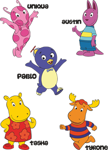
Backyardigans COLOR
- yellow
- olive
- purple
- red
Desenho COLORIDO vetorizado de todos os backyardigans.
View Logo

American Public Television
- black
- white
- purple
- silver
The logo for American Public Television.
View Logo