Cablevision Monterrey Logo
Sistema de Television por cable
Logo

About Cablevision Monterrey Logo
The logo features a circular design in a vibrant blue color, symbolizing connectivity and communication. Inside the circle, there is a stylized yellow arc that intersects the circle, creating a sense of energy and movement. This arc appears to represent a signal or wave, emphasizing the company's focus on cable and telecommunications services.
The company name, “CABLEVISION,” is prominently displayed in bold, uppercase letters below the circular symbol. The font is modern and slightly rounded, making it approachable and easy to read. The text is colored in a strong shade of blue, matching the circle above.
Beneath “CABLEVISION,” the word “MONTERREY” is presented in a smaller font size, also in uppercase letters but spaced more closely together. It is colored in blue as well, maintaining the consistent color scheme throughout the logo.
Overall, the logo conveys a sense of professionalism and innovation, with its combination of vibrant colors, modern font, and dynamic shapes, effectively representing Cablevision Monterrey's brand identity.
The Cablevision Monterrey logo is a medium logo made up of around 4 different colors.
The Cablevision Monterrey logo is quite a simple logo made up of just one shape, it consists of just 1 rectangle.
We have pulled the following text out of the logo: QBLQ ISION IIIIIIIII.
The Cablevision Monterrey logo is made up of a bunch of different colors. These colors include teal, yellow and olive. Beyond those 3 basic colors there are also 4 more specific colors found, these include ocean blue, bright yellow, booger and dirty blue.
The Cablevision Monterrey logo is a Cablevision Monterrey, Television, Media, Mexico, Cablevision and Monterrey logo.
Advanced colors
Hex colors
Similar Logos
The following logos are similar to this logo.



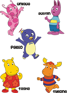
Backyardigans COLOR
- yellow
- olive
- purple
- red
Desenho COLORIDO vetorizado de todos os backyardigans.
View Logo

American Public Television
- black
- white
- purple
- silver
The logo for American Public Television.
View Logo