Cabo Mais Logo
Logo

About Cabo Mais Logo
The logo for Cabo Mais features a modern and dynamic design primarily composed of vibrant colors and distinct shapes. At the center of the logo is a stylized globe in a light blue hue, symbolizing connectivity and global reach. Superimposed on the globe are two orange arrows, one pointing to the right and one curving upwards, which suggest movement and progress.
Below the globe, the text "CABO MAIS" is prominently displayed in bold, uppercase letters. The font is a clean, sans-serif style in a deep blue color, enhancing its visibility and professionalism. Beneath this main text, there's a tagline that reads "A SUA TV VIA CABE," presented in a smaller font, which is also in blue. The overall composition conveys a sense of trust, innovation, and reliability, making it easily recognizable and memorable for viewers.
The Cabo Mais logo is a medium logo made up of around 5 different colors.
The Cabo Mais logo contains a number of different shapes, including 6 squares, 1 rectangle and 3 circles.
The Cabo Mais logo is made up of a bunch of different colors. These colors include teal, olive and silver. Beyond those 3 basic colors there are also 5 more specific colors found, these include cobalt, pumpkin orange, dusty blue, light peach and cloudy blue.
The Cabo Mais logo is a Television, Media, Brazil, Cabo and Mais logo.
Advanced colors
Hex colors
Similar Logos
The following logos are similar to this logo.

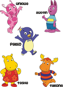
Backyardigans COLOR
- yellow
- olive
- purple
- red
Desenho COLORIDO vetorizado de todos os backyardigans.
View Logo
American Public Television
- black
- white
- purple
- silver
The logo for American Public Television.
View Logo