Cafe Tacuba Logo
Logo

About Cafe Tacuba Logo
The logo for Cafe Tacuba features the company name presented in a stylized, modern font. The text is predominantly in uppercase letters, creating a bold and impactful appearance. The letters are designed with angular, geometric shapes, giving the logo a distinct, artistic flair. The color scheme is simple yet effective, using a solid black against a white background, which enhances its visibility and prominence.
Each letter has a unique form; for instance, the letter "C" is curved, while the letters "A" and "T" have sharp, pointed elements that contribute to the overall dynamic look. The letter "V" is elegantly integrated into the text, creating a seamless connection between the letters. The overall typography reflects a contemporary style, echoing a blend of culture and modernity that resonates with the essence of the brand.
The overall composition is well-balanced, making it easily recognizable and memorable. This logo embodies a fusion of tradition and modern design, appealing to a diverse audience. It serves as an iconic representation of the Cafe Tacuba brand, making it suitable for various marketing materials.
The Cafe Tacuba logo is a music logo made up of around 1 different colors.
The Cafe Tacuba logo is quite a simple logo made up of just one shape, it consists of just 1 rectangle.
The Cafe Tacuba logo is a Music, Mexico and Cafe logo.
Basic Colors
We've taken a look at the image and pulled out some colors that are common across lots of logos. The colors below aren't the exact colors found in the image, but approximations to common colors.
Advanced Colors
We've extracted the below 'advanced colors' from the logo. These should be much closer to the actual colors found in the logo. Our extractor tries to only take the main colors of the image and tries to ignore shading on anti-aliasing or shadows. This generally leads to better results, but in some circumstances you might find a few unusual colors being pulled from the logo.
Hex Colors
The below are the hex colors that are found in the logo. You can assume that these are the actual colors used in the logo. Our color extraction tool that takes the colors from the logo tries to ignore anti-aliasing and shadows, so you may sometimes find a slightly odd result, but this is rare. These colors should be very similar to the Advanced Colors, but you'll notice subtle differences. If you're interested in the exact color then use the hex, but if you're trying to describe the logo then use the Advanced Color or the Basic Color above.
Similar Logos
The following logos are similar to this logo.


Moono Music
- black
- red
- teal
- aqua
- purple
you want do any type of 3d logo design so contact me on whatsapp or send me mail whatsapp number +91...
View Logo
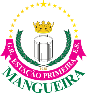
GRES Estação Primeira de Mangueira
- purple
- teal
- yellow
- silver
- olive
Escudo do Grêmio Recreativo e Escola de Samba Estação Primeira de Mangueira.
View Logo
GRES Acadêmicos do Salgueiro
- red
- silver
- white
Escudo do Grêmio Recreativo e Escola de Samba Acadêmicos do Salgueiro, agremiação do Rio de Jane...
View Logo