Canal RCN Logo
TV channel
Logo

About Canal RCN Logo
The logo in question is composed of the letters "RCN" designed in a modern and stylized manner. The "R" and "N" are in a bold blue color, whereas the "C" is in a bright green color and is placed in such a way that it connects the "R" and the "N" seamlessly. The "C" dips below the baseline established by the "R" and "N" and curls upwards, forming an almost complete circle.
Below this configuration of letters, the word "TELEVISION" appears in an all-caps, sans-serif font. It is smaller in size compared to the primary letters and is also in blue color, providing a visual balance and clear association with the brand name above.
There are no additional shapes, icons or embellishments outside of the stylized text. The background is transparent, and the overall design has a clean, professional look, likely intended to convey a sense of trustworthiness and modernity that's typical for a television network brand identity.
The Canal RCN logo is a medium logo made up of around 5 different colors.
The Canal RCN logo is quite a simple logo made up of just one shape, it consists of just 1 rectangle.
The Canal RCN logo is made up of a bunch of different colors. These colors include teal, olive and black. Beyond those 3 basic colors there are also 5 more specific colors found, these include medium blue, apple, dark, dusty teal and dirty blue.
The Canal RCN logo is a Television, Media, Colombia, Canal and Rcn logo.
Advanced colors
Hex colors
Similar Logos
The following logos are similar to this logo.



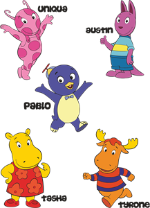
Backyardigans COLOR
- yellow
- olive
- purple
- red
Desenho COLORIDO vetorizado de todos os backyardigans.
View Logo
American Public Television
- black
- white
- purple
- silver
The logo for American Public Television.
View Logo