Cartoon Network Logo
A bold, high-contrast mark made from two large, geometric letters — a stylised 'C' and an 'N' — placed side-by-side to form a compact square/rectangular block. The 'C' appears as a bright (light) glyph while the 'N' reads as a dark (filled)...
Logo

About Cartoon Network
A bold, high-contrast mark made from two large, geometric letters — a stylised 'C' and an 'N' — placed side-by-side to form a compact square/rectangular block. The 'C' appears as a bright (light) glyph while the 'N' reads as a dark (filled) glyph, producing a stark black-and-white contrast.
Beneath the CN block is a compact uppercase wordmark reading "CARTOON NETWORK" in a heavy, condensed sans-serif. The overall look is minimal, blocky and highly legible at small sizes.
What's in it: letter C letter N
Shapes: square/block wordmark block letters
Style: minimalist bold monochrome geometric flat
Text in logo: CARTOON NETWORK
Initials 'C' and 'N' as a compact, high-contrast mark representing the network's name (Cartoon Network).
Colors
Extracted from the image. How we pick the colors →
Cartoon Network Logo History
Cartoon Network is an American cable television channel launched in 1992 by Turner Broadcasting; it is part of the Warner Bros. Discovery family of brands.
Frequently asked
What do the letters C and N stand for?
They are the initials for Cartoon Network.
What colors does this logo use?
Monochrome — black (#000000) and white (#FFFFFF).
Is there additional text in the logo?
Yes — the uppercase wordmark 'CARTOON NETWORK' appears below the CN block.
Similar logos



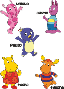
Backyardigans COLOR
- yellow
- olive
- purple
- red
Desenho COLORIDO vetorizado de todos os backyardigans.
View Logo