CBC Radio-Canada 1970-1980 Logo
CBC Radio-Canada logo during the years 1970 and 1980.
Logo

About CBC Radio-Canada 1970-1980 Logo
The logo features a circular design with a bold and vibrant color palette. It consists of a series of overlapping shapes that create a stylized representation of sound waves or broadcasting waves. The outer layer of the logo is a deep blue circle, which creates a strong contrast against the inner colors.
Within the blue border, the logo showcases alternating colors of orange and yellow, arranged in a pattern that gives the impression of petals or circular segments radiating from the center. The central element of the design is a prominent red circle, which is surrounded by a slightly smaller orange circle, creating a sense of depth and focus.
The overall effect is that of dynamic and engaging visuals, ideal for representing a media company. The shapes are rounded and smooth, contributing to a friendly and inviting appearance. This logo, representing CBC Radio-Canada from the years 1970 to 1980, combines a modern aesthetic with elements that evoke communication and connection.
The CBC Radio-Canada 1970-1980 logo is a medium logo made up of around 5 different colors.
The CBC Radio-Canada 1970-1980 logo is quite a simple logo made up of just one shape, it consists of just 1 square.
The CBC Radio-Canada 1970-1980 logo is made up of a bunch of different colors. These colors include blue, red, yellow, purple and olive. Beyond those 5 basic colors there are also 5 more specific colors found, these include true blue, red orange, marigold, dirty purple and mocha.
The CBC Radio-Canada 1970-1980 logo is a Television, Media, Canada, Cbc and Radio-Canada logo.
Basic colors
Approximations to common color names. How we pick the colors →
Advanced colors
Hex colors
Similar Logos
The following logos are similar to this logo.



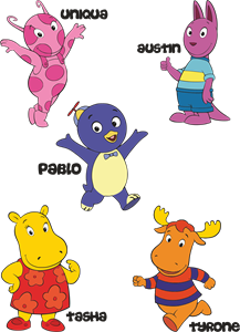
Backyardigans COLOR
- yellow
- olive
- purple
- red
Desenho COLORIDO vetorizado de todos os backyardigans.
View Logo

American Public Television
- black
- white
- purple
- silver
The logo for American Public Television.
View Logo