Freesat Logo
Logo

About Freesat Logo
The logo is composed of a graphical element and a text component. The graphical element consists of four overlapping circles in a petal-like arrangement, with each circle filled with a different color—orange, blue, green, and purple—and casting a slight shadow to create a sense of depth. The circles overlap in such a way that various new colors can be seen where they intersect, including shades of gray and a lilac color.
Below this abstract, colorful design is the wordmark "freesat" in lowercase letters. The text is bold and appears to be in a sans-serif typeface that provides a modern, clean look. The color of the text is white, and it stands out prominently against a dark gray or black background.
Beneath the company name, there is a tagline "brilliant for everyone" in smaller, white, lowercase sans-serif letters. The tagline is centrally aligned with the company name above it, reinforcing the logo's balanced and symmetric characteristics.
The logo's combination of vibrant colors and minimalist text design conveys a sense of innovation and accessibility, likely aiming to reflect the company's identity and the value proposition of its services.
The Freesat logo is a medium logo made up of around 5 different colors.
The Freesat logo contains a number of different shapes, including 27 squares, 1 rectangle, 1 pentagon, 12 stars and 68 circles.
The Freesat logo is made up of a bunch of different colors. These colors include purple, green, yellow and teal. Beyond those 4 basic colors there are also 5 more specific colors found, these include hot pink, purple, spruce, tangerine and peacock blue.
The Freesat logo is a Freesat, Television, Media and United Kingdom logo.
Basic colors
Approximations to common color names. How we pick the colors →
Advanced colors
Hex colors
Similar Logos
The following logos are similar to this logo.



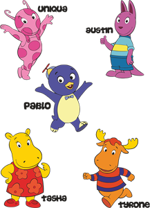
Backyardigans COLOR
- yellow
- olive
- purple
- red
Desenho COLORIDO vetorizado de todos os backyardigans.
View Logo

American Public Television
- black
- white
- purple
- silver
The logo for American Public Television.
View Logo