Fuji Television Network Logo
Logo

About Fuji Television Network Logo
The logo features a distinctive circular design that embodies a modern and dynamic aesthetic. At the center, there is a bold red dot, symbolizing energy and focus. Surrounding this central dot is the text “FUJI TELEVISION NETWORK, INC.” which is presented in a unique, slightly curved format.
The text is rendered in a dark color, contrasting sharply with the vibrant red of the central dot. The font is clean and sans-serif, conveying a contemporary look. The arrangement of the text suggests a circular flow, guiding the viewer's eye around the logo.
Overall, the logo combines the simplicity of geometric shapes with impactful color choices, making it memorable and easily recognizable. It encapsulates the essence of a vibrant media company while maintaining a professional appearance. This logo is often associated with broadcast media and is iconic within the Japanese television landscape.
The Fuji Television Network logo is a medium logo made up of around 2 different colors.
The Fuji Television Network logo is quite a simple logo made up of just one shape, it consists of just 1 square.
We have pulled the following text out of the logo: RVZ AXQO QZWON N XOAS A MY.
The Fuji Television Network logo is a Television, Media, Fuji and Network logo.
Advanced colors
Hex colors
Similar Logos
The following logos are similar to this logo.



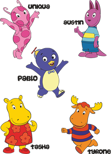
Backyardigans COLOR
- yellow
- olive
- purple
- red
Desenho COLORIDO vetorizado de todos os backyardigans.
View Logo

American Public Television
- black
- white
- purple
- silver
The logo for American Public Television.
View Logo