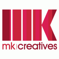
MK Logo
Caradon MK Electric Limited
Logo

About MK Logo
The logo features a bold and modern design, prominently showcasing the letters "MK" in a stylized format. The letters are inscribed within an oval shape, which is set against a vibrant red rectangular background. The oval itself is outlined in a darker shade, providing a clear contrast that enhances the visibility of the "MK."
Beneath the oval, the full company name "Caradon MK Electric Limited" is displayed in a clean and professional font. The text is predominantly in a dark tone, ensuring readability against a lighter, almost white background. The word "Caradon" is situated on the left side of the text, while "MK Electric Limited" follows, indicating the company’s focus on electrical services.
Additionally, there is a small green element incorporated into the design, resembling a leaf or a droplet, positioned at the beginning of the word "MK." This detail adds a touch of color and may symbolize innovation or a commitment to sustainability.
Overall, the logo presents a strong visual identity, combining bold colors and clear typography to convey a sense of reliability and professionalism in the electrical industry.
The MK logo is a service logo made up of around 3 different colors.
The MK logo is quite a simple logo made up of just one shape, it consists of just 1 rectangle.
We have pulled the following text out of the logo: MWWHIHM.
The MK logo is made up of a bunch of different colors. These colors include red, navy and teal. Beyond those 3 basic colors there are also 3 more specific colors found, these include tomato, marine blue and shamrock.
The MK logo is a Mk and Services logo.
Basic Colors
We've taken a look at the image and pulled out some colors that are common across lots of logos. The colors below aren't the exact colors found in the image, but approximations to common colors.
Advanced Colors
We've extracted the below 'advanced colors' from the logo. These should be much closer to the actual colors found in the logo. Our extractor tries to only take the main colors of the image and tries to ignore shading on anti-aliasing or shadows. This generally leads to better results, but in some circumstances you might find a few unusual colors being pulled from the logo.
Hex Colors
The below are the hex colors that are found in the logo. You can assume that these are the actual colors used in the logo. Our color extraction tool that takes the colors from the logo tries to ignore anti-aliasing and shadows, so you may sometimes find a slightly odd result, but this is rare. These colors should be very similar to the Advanced Colors, but you'll notice subtle differences. If you're interested in the exact color then use the hex, but if you're trying to describe the logo then use the Advanced Color or the Basic Color above.
Similar Logos
The following logos are similar to this logo.


MK Creative Agency
- red
- black
Graphic Design, Architecture, Architectural Modeling, Industrial Design, Marketing
View Logo