Nika TV Logo
Ника Телекомпания
Logo

About Nika TV Logo
The logo in question is primarily composed of a bright blue square background. Centered on this blue square is a white circle which encases the company's design elements. Inside the circle, there is a distinctive white graphic feature resembling a stylized, upward-pointing flame or wing with four feather-like extensions, giving it a dynamic and swift appearance.
Overlaying part of the bottom of the circular boundary is the company name "НИКА" in bold, capitalized white Cyrillic characters. Directly beneath this name, forming the bottom part of the circle, is the word "TV" also in white and in a smaller font size compared to "НИКА", signifying the company's association with television.
The combination of the vivid blue and white color scheme and the sharp, fast imagery of the flame or wing-like symbol within the circular outline is likely intended to convey themes of speed, efficiency, movement, and perhaps creativity or innovation. This stylized iconography is emblematic of a company identity within the TV or media industry.
The Nika TV logo is a medium logo made up of around 2 different colors.
The Nika TV logo contains a number of different shapes, including 9 squares, 4 stars and 27 circles.
The Nika TV logo is a Television, Media, Nika and Tv logo.
Advanced colors
Hex colors
Similar Logos
The following logos are similar to this logo.




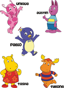
Backyardigans COLOR
- yellow
- olive
- purple
- red
Desenho COLORIDO vetorizado de todos os backyardigans.
View Logo
American Public Television
- black
- white
- purple
- silver
The logo for American Public Television.
View Logo