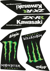
Ninja 650 Logo
Logo

About Ninja 650 Logo
The logo features the word "Ninja" in a stylized font that has sharp, angled lines, conveying a sense of speed and cutting-edge style. The letters are capitalized and slanted to the right, suggesting movement. The color of the "Ninja" text is predominantly black with a metallic or glossy finish, and there is a subtle reflection effect beneath, implying a sense of sleekness and precision.
To the right of the word "Ninja," there is the number "650," which is in a smaller, more standard and upright font compared to the "Ninja" text. The "650" has a simpler design, with no additional effects, making it clear and easy to read. It is placed slightly higher than the baseline of the "Ninja" text, suggesting it is associated but not identical in style or emphasis.
The overall effect of the logo is to communicate a modern, dynamic, and high-performance sensibility, typically associated with the type of product that uses such branding—a reference to the Kawasaki Ninja 650 motorcycle model.
The Ninja 650 logo is a automotive and car logo made up of around 5 different colors.
The Ninja 650 logo contains a number of different shapes, including 7 squares, 1 rectangle, 2 stars and 4 circles.
The Ninja 650 logo is made up of a bunch of different colors. These colors include green, black, olive, silver and white. Beyond those 5 basic colors there are also 5 more specific colors found, these include medium green, almost black, gunmetal, grey and very light pink.
The Ninja 650 logo is a Kawasaki, Ninja and Auto And Moto logo.
Basic colors
Approximations to common color names. How we pick the colors →
Advanced colors
Hex colors
Similar Logos
The following logos are similar to this logo.