nip / tuck Logo
TV Show Series
Logo

About nip / tuck Logo
The logo features the text "nip / tuck" in a modern, sleek font. The "nip" is in lowercase letters and appears bold, emphasizing the first part of the company name. The "/" is slanted and acts as a visual divider, transitioning smoothly into "tuck," which is also in lowercase but has a lighter font weight compared to "nip."
The text is predominantly black, creating a strong contrast against the background. Directly above the "n" in "nip," there is an illustration of a surgical scalpel, which adds a relevant visual element that signifies the nature of the company, likely related to cosmetic surgery or aesthetic procedures.
Below the main text, there is a red horizontal line that runs the width of the text, adding a pop of color and further separation from the tagline below. The tagline reads "TRUTH IS ONLY SKIN DEEP" in uppercase letters, using a more understated font compared to the main logo text, emphasizing the message while maintaining readability. The tagline is also black, aligning it harmoniously with the overall color scheme of the logo.
In summary, this logo combines a clean, contemporary aesthetic with elements that clearly communicate its connection to beauty and surgical services, making it visually appealing and easy to recognize.
The nip / tuck logo is a medium logo made up of around 4 different colors.
This logo for nip / tuck doesn't contain any obvious shapes.
The nip / tuck logo is made up of a bunch of different colors. These colors include red, black and silver. Beyond those 3 basic colors there are also 4 more specific colors found, these include strawberry, almost black, medium grey and silver.
The nip / tuck logo is a Television, Media, United States, Nip and Tuck logo.
Advanced colors
Hex colors
Similar Logos
The following logos are similar to this logo.


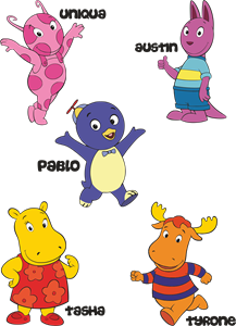
Backyardigans COLOR
- yellow
- olive
- purple
- red
Desenho COLORIDO vetorizado de todos os backyardigans.
View Logo

American Public Television
- black
- white
- purple
- silver
The logo for American Public Television.
View Logo