Pronto Sky Logo
SKY paytv IT
Logo
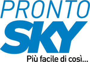
About Pronto Sky Logo
The logo for 'Pronto Sky' consists of two words arranged on a single line. The word 'PRONTO' is in all capital letters and the 'SKY' immediately follows it in the same line but with slightly smaller capital letters, indicating possibly a sub-brand or a secondary element of the main brand. The typeface used for both words is sans-serif, featuring clean and modern looking letters with uniform thickness.
The letters in 'PRONTO' and 'SKY' are colored in a shade of blue, which could represent the sky, a key theme for the brand name. There are no additional symbols or graphics accompanying the text, making the logo text-based and straightforward in design. The focus on the name itself suggests a brand identity that emphasizes clarity and directness. The blue color could also imply trustworthiness and reliability, qualities that are often associated with the color in branding.
The Pronto Sky logo is a medium logo made up of around 2 different colors.
The Pronto Sky logo is quite a simple logo made up of just one shape, it consists of just 1 rectangle.
We have pulled the following text out of the logo: IIIIIIIIIIIIIIIIII.
The Pronto Sky logo is a Television, Media, Italy, Pronto and Sky logo.
Basic Colors
We've taken a look at the image and pulled out some colors that are common across lots of logos. The colors below aren't the exact colors found in the image, but approximations to common colors.
Advanced Colors
We've extracted the below 'advanced colors' from the logo. These should be much closer to the actual colors found in the logo. Our extractor tries to only take the main colors of the image and tries to ignore shading on anti-aliasing or shadows. This generally leads to better results, but in some circumstances you might find a few unusual colors being pulled from the logo.
Hex Colors
The below are the hex colors that are found in the logo. You can assume that these are the actual colors used in the logo. Our color extraction tool that takes the colors from the logo tries to ignore anti-aliasing and shadows, so you may sometimes find a slightly odd result, but this is rare. These colors should be very similar to the Advanced Colors, but you'll notice subtle differences. If you're interested in the exact color then use the hex, but if you're trying to describe the logo then use the Advanced Color or the Basic Color above.
Similar Logos
The following logos are similar to this logo.


Backyardigans COLOR
- yellow
- olive
- purple
- red
Desenho COLORIDO vetorizado de todos os backyardigans.
View Logo
American Public Television
- black
- white
- purple
- silver
The logo for American Public Television.
View Logo