Quantel Logo
This is the official Quantel logo
Logo

About Quantel Logo
The Quantel logo features a distinctive, modern design characterized by a circular element. The circular shape is predominantly teal, with a smaller, darker teal dot nestled within its outline, giving a sense of depth and dimension. This circular motif is positioned to the left of the text.
Next to the circular emblem, the company name "Quantel" is displayed in a clean, contemporary sans-serif font. The text is rendered in a muted gray color, providing a nice contrast to the vibrant teal of the logo. The letter “Q” in "Quantel" is capitalized and stands out as the first letter of the name, which adds emphasis to the brand.
Overall, the logo combines geometric shapes with a sophisticated color palette, conveying a sense of innovation and professionalism. The simplicity of the design ensures versatility across various mediums, making it easily recognizable. The combination of the teal circle and gray text creates a balanced and aesthetically pleasing logo, suitable for a technology-focused company.
The Quantel logo is a medium logo made up of around 2 different colors.
The Quantel logo contains a number of different shapes, including 5 squares and 1 rectangle.
We have pulled the following text out of the logo: Q QUMEI.
The Quantel logo is a Quantel, Television, Media and United Kingdom logo.
Advanced colors
Hex colors
Similar Logos
The following logos are similar to this logo.



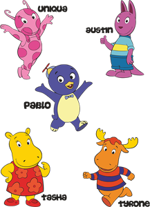
Backyardigans COLOR
- yellow
- olive
- purple
- red
Desenho COLORIDO vetorizado de todos os backyardigans.
View Logo

American Public Television
- black
- white
- purple
- silver
The logo for American Public Television.
View Logo