Rai Due Logo
Second National Italian Television.
Logo

About Rai Due Logo
The logo features a bold and vibrant red background that captures immediate attention. Centrally positioned within the logo is a unique, stylized design that consists of two symmetrical shapes resembling abstract profiles or the outlines of faces. These shapes are white and are divided by a vertical and horizontal line that creates a cross-like effect in the center.
The text "Rai" and "Due" is prominently displayed in a clean, modern sans-serif font. The word "Rai" is positioned on the left side of the logo, while "Due" sits on the right side. Both words are rendered in a striking white color, which contrasts sharply against the red backdrop.
The overall composition of the logo merges the visual elements of the outlined profiles with the textual components, suggesting themes of connection, communication, or dual perspectives. The simplicity of the design, combined with its bold color scheme, makes the logo easily recognizable and memorable.
The Rai Due logo is a medium logo made up of around 3 different colors.
The Rai Due logo contains a number of different shapes, including 1 square, 7 stars and 6 circles.
The Rai Due logo is a Television, Media, Italy, Rai and Due logo.
Advanced colors
Hex colors
Similar Logos
The following logos are similar to this logo.

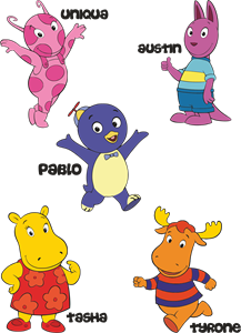
Backyardigans COLOR
- yellow
- olive
- purple
- red
Desenho COLORIDO vetorizado de todos os backyardigans.
View Logo
American Public Television
- black
- white
- purple
- silver
The logo for American Public Television.
View Logo