Sun Channel Tourism TV Logo
Logo

About Sun Channel Tourism TV Logo
The logo features a distinctive design that combines both text and a graphic element. At the top of the logo, there is a bold, semi-circular arch that represents the sun, rendered in a vibrant orange color. This sun-like shape is visually striking and adds a sense of warmth and positivity to the overall design.
Beneath this arch, the word "sun" is displayed in lowercase letters, crafted in a robust, modern sans-serif typeface. The letters "s," "u," and "n" are all in a dark black color, which provides a strong contrast against the bright orange sun above. The font is clean and easily legible, conveying a sense of clarity and professionalism.
Located to the right of the word "sun," the word "channel" is also presented in lowercase letters but uses a slightly smaller font size compared to "sun." It maintains the same black color, creating a cohesive look. The overall layout is horizontally oriented, with the sun graphic positioned above the text, drawing attention to the name of the company while also symbolizing brightness, joy, and tourism.
This logo effectively communicates the essence of the company, suggesting a focus on travel and sunny destinations through its use of color and imagery.
The Sun Channel Tourism TV logo is a medium logo made up of around 2 different colors.
The Sun Channel Tourism TV logo is quite a simple logo made up of just one shape, it consists of just 1 square.
The Sun Channel Tourism TV logo is a Television, Media, Venezuela, Sun, Channel, Tourism and Tv logo.
Advanced colors
Hex colors
Similar Logos
The following logos are similar to this logo.



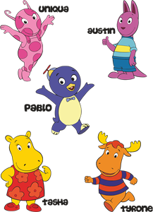
Backyardigans COLOR
- yellow
- olive
- purple
- red
Desenho COLORIDO vetorizado de todos os backyardigans.
View Logo

American Public Television
- black
- white
- purple
- silver
The logo for American Public Television.
View Logo