Survivor Expedition Robinson (B&W) Logo
A 2007 edition of reality show, produced and broadcasted by bTV.
Logo

About Survivor Expedition Robinson (B&W) Logo
The logo features a bold and striking design that captures a sense of adventure and ruggedness. At the center, the word "SURVIVOR" is displayed prominently in large, uppercase letters. The font used is thick and strong, evoking a feeling of resilience.
Above the word "SURVIVOR," there is a decorative banner with the text “EXPEDITION” on the left side and “ROBINSON” on the right side, both set in a smaller, yet equally bold font. The letters are stylized, potentially featuring some curvature, which adds a dynamic element to the overall look.
Behind the central text, there is an intricate graphic featuring a skull, which adds a sense of edginess and danger associated with survival and exploration themes. The skull is adorned with crossed bones, reminiscent of pirate imagery, reinforcing the adventurous spirit of the logo.
Surrounding the central elements, there are compass-like details that suggest navigation, adventure, and the outdoors. These designs may include directional arrows or circle outlines that enhance the theme of exploration.
The color scheme is primarily black and white, giving it a classic and bold appearance. The monochrome palette helps the logo stand out clearly while also conveying a rugged and tough aesthetic. The overall composition of the logo balances text and imagery effectively, making it eye-catching and easily recognizable for fans of adventure and survival themes.
The Survivor Expedition Robinson (B&W) logo is a medium logo made up of around 1 different colors.
The Survivor Expedition Robinson (B&W) logo is quite a simple logo made up of just one shape, it consists of just 1 rectangle.
The Survivor Expedition Robinson (B&W) logo is a Television, Media, Bulgaria, Survivor, Expedition, Robinson and B&W logo.
Advanced colors
Hex colors
Similar Logos
The following logos are similar to this logo.



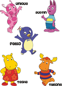
Backyardigans COLOR
- yellow
- olive
- purple
- red
Desenho COLORIDO vetorizado de todos os backyardigans.
View Logo

American Public Television
- black
- white
- purple
- silver
The logo for American Public Television.
View Logo