Telehit Logo
El mismo que el de HINO pero mejor.
Logo

About Telehit Logo
The logo consists of the word "Telehit" written in lowercase letters, with a distinctive graphic element placed above it. The text is depicted in a bold, sans-serif font and is colored white. The graphic element features a stylized spiral or swirl design that resembles a snail shell or a hypnotic pattern. This spiral is rendered in various shades of blue, creating a sense of depth through the use of gradients. Two small white circles are positioned near the bottom of the spiral, suggesting a reflection or gleam. The entire logo is presented against a transparent background, which allows it to be placed over different colors or images without a defining border. The blue color scheme of the spiral, combined with the white text, gives the logo a crisp and modern appearance that is likely intended to convey a sense of dynamism and entertainment, consistent with a media or TV channel brand identity.
The Telehit logo is a medium logo made up of around 5 different colors.
The Telehit logo contains a number of different shapes, including 1 rectangle, 1 star and 1 circle.
We have pulled the following text out of the logo: EEHW.
The Telehit logo is made up of a bunch of different colors. These colors include aqua, black, teal, silver and purple. Beyond those 5 basic colors there are also 5 more specific colors found, these include azure, black, peacock blue, grey and charcoal grey.
The Telehit logo is a Telehit, Television, Media and Mexico logo.
Basic colors
Approximations to common color names. How we pick the colors →
Advanced colors
Hex colors
Similar Logos
The following logos are similar to this logo.



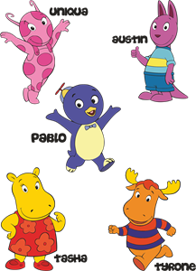
Backyardigans COLOR
- yellow
- olive
- purple
- red
Desenho COLORIDO vetorizado de todos os backyardigans.
View Logo

American Public Television
- black
- white
- purple
- silver
The logo for American Public Television.
View Logo