The Twilight Zone Logo
Logo from the 60's Sci-fi Show
Logo

About The Twilight Zone Logo
The logo features a distinctive black and white design that captures the essence of its brand. Central to the logo is a stylized depiction of an eye, which is often associated with themes of perception and reality. The eye is rendered in black, with a white pupil that subtly draws attention. Above the eye, there are two smaller white shapes that resemble floating crescent forms, adding a surreal quality to the overall design.
The background of the logo is predominantly black, emphasizing the stark contrast of the white elements. This color scheme enhances the mysterious and intriguing nature of the brand. The logo does not include any text, allowing the imagery to stand alone in conveying its themes of the unknown and the uncanny.
Overall, the logo is simple yet striking, effectively representing the company's focus on exploring the boundaries of imagination and reality. It may appeal to those who appreciate minimalist design paired with intriguing conceptual elements.
The The Twilight Zone logo is a medium logo made up of around 2 different colors.
The The Twilight Zone logo contains a number of different shapes, including 1 square, 1 rectangle and 2 circles.
We have pulled the following text out of the logo: TILC TWILIGHT ZONE.
The The Twilight Zone logo is a Television, Media, Argentina, Twilight and Zone logo.
Advanced colors
Hex colors
Similar Logos
The following logos are similar to this logo.



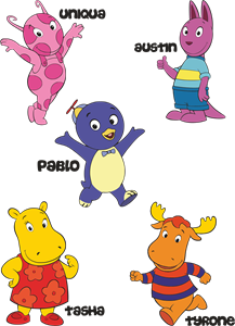
Backyardigans COLOR
- yellow
- olive
- purple
- red
Desenho COLORIDO vetorizado de todos os backyardigans.
View Logo

American Public Television
- black
- white
- purple
- silver
The logo for American Public Television.
View Logo