The Wonder Years Logo
Logo

About The Wonder Years Logo
The logo features the text "The Wonder Years" prominently displayed in a vibrant and playful style. The word "The" is placed above "WONDER YEARS" and is colored in a bright yellow, giving it a cheerful and inviting look.
The word "WONDER" is the focal point of the logo, rendered in bold, uppercase letters and colored in striking pink, which adds a sense of excitement and energy. Below "WONDER," the word "YEARS" is also in uppercase letters but in a softer blue shade, creating a pleasing visual contrast.
The text is separated by horizontal lines: one above "WONDER" and one below "YEARS," both in a thin line that complements the overall design without overwhelming it. The background is solid black, which enhances the vibrancy of the colors used in the text.
The logo conveys a sense of nostalgia and fun, suitable for a brand that aims to evoke memories of childhood and joyful experiences.
The The Wonder Years logo is a medium logo made up of around 5 different colors.
The The Wonder Years logo is quite a simple logo made up of just one shape, it consists of just 1 rectangle.
We have pulled the following text out of the logo: TIIG WONDER YEARS.
The The Wonder Years logo is made up of a bunch of different colors. These colors include purple, yellow, aqua, teal and maroon. Beyond those 5 basic colors there are also 5 more specific colors found, these include cerise, off yellow, turquoise blue, deep teal and plum.
The The Wonder Years logo is a Television, Media, Mexico, Wonder and Years logo.
Basic colors
Approximations to common color names. How we pick the colors →
Advanced colors
Hex colors
Similar Logos
The following logos are similar to this logo.



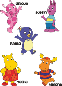
Backyardigans COLOR
- yellow
- olive
- purple
- red
Desenho COLORIDO vetorizado de todos os backyardigans.
View Logo

American Public Television
- black
- white
- purple
- silver
The logo for American Public Television.
View Logo