TVP KULTURA Logo
Logo

About TVP KULTURA Logo
The logo features a clean and modern design with a focus on typography. It consists of the letters "TVP" prominently displayed in a bold, uppercase font, positioned within a rectangular frame that divides the logo into three sections. The "T," "V," and "P" are enclosed in separate sections, giving the logo a structured appearance.
The word "KULTURA" is placed directly underneath "TVP," also in uppercase letters, but in a slightly smaller size. This text is aligned centrally and uses a sans-serif typeface that complements the boldness of "TVP."
The overall color scheme is stark, with the text presented in white against a solid black background. This high contrast enhances visibility and makes the logo easily recognizable. The combination of geometric shapes and clean lines contributes to a contemporary feel, reflecting the cultural and media focus of the company.
The logo's layout and use of space convey professionalism and modernity, making it suitable for a cultural television platform.
The TVP KULTURA logo is a medium logo made up of around 4 different colors.
The TVP KULTURA logo contains a number of different shapes, including 5 rectangles, 6 stars and 7 circles.
We have pulled the following text out of the logo: IIEI KU LTU RA.
The TVP KULTURA logo is made up of a bunch of different colors. These colors include black, white, silver and purple. Beyond those 4 basic colors there are also 4 more specific colors found, these include black, white, greyish and charcoal grey.
The TVP KULTURA logo is a Television, Media, Poland, Tvp and Kultura logo.
Basic colors
Approximations to common color names. How we pick the colors →
Advanced colors
Hex colors
Similar Logos
The following logos are similar to this logo.



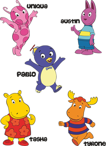
Backyardigans COLOR
- yellow
- olive
- purple
- red
Desenho COLORIDO vetorizado de todos os backyardigans.
View Logo

American Public Television
- black
- white
- purple
- silver
The logo for American Public Television.
View Logo