United Federation of Planets Logo
Star Trek
Logo

About United Federation of Planets Logo
The logo in question features a central circular emblem against a black background. Inside the circular emblem, a dark blue field displays a white starfield pattern conveying a celestial theme with varying sizes of stars and several denser clusters, suggesting galaxies or nebulae. This central blue disc is bordered by a thin white outline.
Encircling the blue disc, there is a white laurel wreath design that consists of two symmetrical branches with leaves, creating a classic, venerable feel that often represents victory, achievement, or status. The laurel sits against the black background and appears to emerge beneath the blue central emblem.
Beneath the circular emblem and laurel wreath, the name of the company, "UNITED FEDERATION OF PLANETS," is written in white, capitalized, sans-serif font. The text is on a single line and is centered directly below the emblem, serving as a clear identifier for the company.
The overall color scheme is simple and consists of dark blue, white, and black, providing a high contrast and making the design stand out. The use of celestial imagery and classic symbolism combines to give a sense of exploration and unity, fitting for a name like "United Federation of Planets."
The United Federation of Planets logo is a medium logo made up of around 5 different colors.
The United Federation of Planets logo contains a number of different shapes, including 150 squares, 5 pentagons, 50 stars and 79 circles.
We have pulled the following text out of the logo: UNWTED FEDEHATIDN BF FLANETS.
The United Federation of Planets logo is made up of a bunch of different colors. These colors include teal, black, silver and olive. Beyond those 4 basic colors there are also 5 more specific colors found, these include cobalt, black, faded blue, cloudy blue and gunmetal.
The United Federation of Planets logo is a Television, Media, United States, United, Federation and Planets logo.
Advanced colors
Hex colors
Similar Logos
The following logos are similar to this logo.

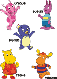
Backyardigans COLOR
- yellow
- olive
- purple
- red
Desenho COLORIDO vetorizado de todos os backyardigans.
View Logo
American Public Television
- black
- white
- purple
- silver
The logo for American Public Television.
View Logo