WDR Logo
WDR -Westdeutscher Rundfunk Dachmarke, ARD
Logo

About WDR Logo
The logo features the letters "WDR" prominently displayed in a bold, sans-serif font. The letters are all uppercase and exhibit a strong, modern aesthetic. The color of the text is a deep black, providing a sharp contrast against the background.
To the left of the "WDR" text, there is a distinctive geometric shape that resembles a light blue rectangle, oriented horizontally. This rectangle provides a visual anchor for the logo and enhances its contemporary feel.
On the upper right side of the logo, there's a small, circular emblem that consists of a lighter blue background with a white number "1" enclosed within it. This element adds a subtle yet recognizable detail that contributes to the overall branding.
The combination of the bold "WDR" text and the geometric shapes creates a cohesive look that is both professional and visually appealing. The color palette predominantly consists of shades of blue, which evoke feelings of trust and reliability, making it an effective representation for the company.
The WDR logo is a medium logo made up of around 1 different colors.
The WDR logo is quite a simple logo made up of just one shape, it consists of just 1 rectangle.
We have pulled the following text out of the logo: WDR.
The WDR logo is a Wdr, Television and Media logo.
Advanced colors
Hex colors
Similar Logos
The following logos are similar to this logo.


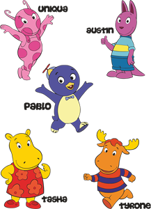
Backyardigans COLOR
- yellow
- olive
- purple
- red
Desenho COLORIDO vetorizado de todos os backyardigans.
View Logo