Wild N Out Logo
Logo
About Wild N Out Logo
The logo features a bold and dynamic design primarily using the colors red, white, and black. At the center, the word "Wild'n Out" is styled in a playful, graffiti-like font, which is predominantly red with white outlining. The text is slanted, conveying a sense of energy and movement.
Above the main text, the words "Nick Cannon" are displayed in a more traditional font style in black, emphasizing the creator's association with the show. This text is smaller in size compared to the main title.
The background is black, which contrasts sharply with the bright colors of the logo, making it visually striking. The overall design conveys a sense of fun and irreverence, aligning with the comedic nature of the show.
The Wild N Out logo is a medium logo made up of around 5 different colors.
The Wild N Out logo contains a number of different shapes, including 20 squares, 17 stars and 39 circles.
We have pulled the following text out of the logo: NICK C VNGN.
The Wild N Out logo is made up of a bunch of different colors. These colors include red, black, silver, maroon and white. Beyond those 5 basic colors there are also 5 more specific colors found, these include dull red, black, dusty pink, purple brown and light pink.
The Wild N Out logo is a Wild N Out, Television, Media, Belgium, Wild and Out logo.
Basic colors
Approximations to common color names. How we pick the colors →
Advanced colors
Hex colors
Similar Logos
The following logos are similar to this logo.


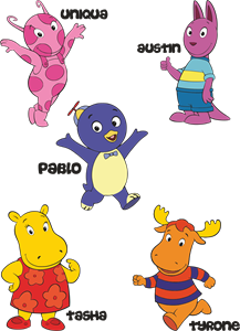
Backyardigans COLOR
- yellow
- olive
- purple
- red
Desenho COLORIDO vetorizado de todos os backyardigans.
View Logo

American Public Television
- black
- white
- purple
- silver
The logo for American Public Television.
View Logo