Estilo Comunicação Visual Logo
Faixas, Banners, Painéis, Personalização de Veículos, Silk Screen, Adesivos em Geral...
Logo

About Estilo Comunicação Visual Logo
The logo depicted is a graphic and typographic combination for "Estilo Comunicação Visual." It consists of a distinctive icon on the left and company name text on the right. The icon features an abstract design, with a stylized lowercase letter 'e' in white color inside a red circular shape with a swooping curve on the top right, creating a visual sense of motion. This red circle is partially overlapped on the right side by a black circular arc.
To the right of the icon, the company name is presented in two different fonts. The word "Estilo" is written in a bold, sans-serif typeface, with a lowercase 'e' that mimics the style of the 'e' in the logo icon, suggesting the continuity of branding. The color of "Estilo" text is a dark shade of grey, almost black. Beneath "Estilo," the phrase "comunicação visual" is written in a lighter, all-lowercase, sans-serif font and it is smaller than the word above it, painted in the same dark grey/black hue.
The palette utilizes a strong contrast between the red, black, and white for the icon and dark grey/black for the text, giving the logo a bold look that stands out. The combination of shapes and text conveys a sense of contemporary style and movement, fitting for a visual communication company.
The Estilo Comunicação Visual logo is a business logo made up of around 2 different colors.
The Estilo Comunicação Visual logo is quite a simple logo made up of just one shape, it consists of just 1 rectangle.
We have pulled the following text out of the logo: GMW MI.
The Estilo Comunicação Visual logo is a Commerce, Business, Brazil, Estilo, Comunicação and Visual logo.
Basic Colors
We've taken a look at the image and pulled out some colors that are common across lots of logos. The colors below aren't the exact colors found in the image, but approximations to common colors.
Advanced Colors
We've extracted the below 'advanced colors' from the logo. These should be much closer to the actual colors found in the logo. Our extractor tries to only take the main colors of the image and tries to ignore shading on anti-aliasing or shadows. This generally leads to better results, but in some circumstances you might find a few unusual colors being pulled from the logo.
Hex Colors
The below are the hex colors that are found in the logo. You can assume that these are the actual colors used in the logo. Our color extraction tool that takes the colors from the logo tries to ignore anti-aliasing and shadows, so you may sometimes find a slightly odd result, but this is rare. These colors should be very similar to the Advanced Colors, but you'll notice subtle differences. If you're interested in the exact color then use the hex, but if you're trying to describe the logo then use the Advanced Color or the Basic Color above.
Similar Logos
The following logos are similar to this logo.
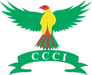
The Chittagong Chamber of Commerce and Industry
- teal
- yellow
- red
- olive
Graphics Mart Kalibari Road, Barishal, Bangladesh Cell: 01733492293
View Logo
Triplex Service Commerce Company Limited
- red
- olive
- teal
- white
- silver
Triplex is an compilation of three domain : Design - the art, Web and Programming - the connection, ...
View Logo