Fuji Television Logo
Logo

About Fuji Television Logo
The logo features a bold and modern design centered around a graphic element resembling a stylized bug with a round red dot in the middle, symbolizing a camera lens or a watchful eye. The body of the bug is represented by two curved antennae extending upwards, while the lower part consists of simplistic, curved shapes that convey a sense of movement and dynamism.
To the right of the graphic is the company name "FUJI TELEVISION" presented in uppercase letters. The text is in a bold, sans-serif font that emphasizes clarity and readability. The word "FUJI" is colored in a vibrant red, matching the red dot in the graphic, while "TELEVISION" is rendered in a darker shade, providing a clear visual contrast.
Overall, the logo combines elements of playfulness and professionalism, effectively representing the media and entertainment industry while being easily recognizable and memorable. The use of colors and shapes conveys a modern and forward-thinking approach, suitable for a leading television company.
The Fuji Television logo is a medium logo made up of around 2 different colors.
The Fuji Television logo is quite a simple logo made up of just one shape, it consists of just 1 rectangle.
We have pulled the following text out of the logo: KSK FUJI TELEVISION.
The Fuji Television logo is a Fuji Television, Television, Media and Fuji logo.
Advanced colors
Hex colors
Similar Logos
The following logos are similar to this logo.




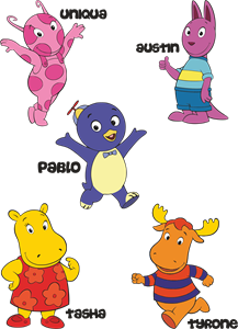
Backyardigans COLOR
- yellow
- olive
- purple
- red
Desenho COLORIDO vetorizado de todos os backyardigans.
View Logo

American Public Television
- black
- white
- purple
- silver
The logo for American Public Television.
View Logo