Rapipago Logo
Rapipago, Venнs , pagбs y listo. Argentina. By Sapo... Cba - Arg
Logo
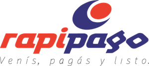
About Rapipago Logo
The Rapipago logo consists of a stylized wordmark combined with an abstract graphic element. The word "rapipago" is written in lowercase letters, with a distinctive, friendly, and modern font. The colors of the letters alternate between red and darker red, giving a vibrant and dynamic contrast.
Above the text, on the left side, there is an abstract symbol that features a large blue circle with a smaller orange circle placed inside the top right section of the blue circle, creating an appearance of a 'C' or a partial orbit. The blue and orange colors used are vivid and eye-catching, drawing attention to the graphic.
The overall design of the logo conveys a sense of speed and efficiency, which fittingly corresponds to the company's name. The color scheme of blue, orange, and red suggests trustworthiness, energy, and boldness. The circles' arrangement in the blue field might evoke a sense of global reach or connectivity, which aligns with the services of the company.
The Rapipago logo is a business logo made up of around 2 different colors.
The Rapipago logo is quite a simple logo made up of just one shape, it consists of just 1 rectangle.
We have pulled the following text out of the logo: MWTPM.
The Rapipago logo is a Commerce, Business and Argentina logo.
Basic Colors
We've taken a look at the image and pulled out some colors that are common across lots of logos. The colors below aren't the exact colors found in the image, but approximations to common colors.
Advanced Colors
We've extracted the below 'advanced colors' from the logo. These should be much closer to the actual colors found in the logo. Our extractor tries to only take the main colors of the image and tries to ignore shading on anti-aliasing or shadows. This generally leads to better results, but in some circumstances you might find a few unusual colors being pulled from the logo.
Hex Colors
The below are the hex colors that are found in the logo. You can assume that these are the actual colors used in the logo. Our color extraction tool that takes the colors from the logo tries to ignore anti-aliasing and shadows, so you may sometimes find a slightly odd result, but this is rare. These colors should be very similar to the Advanced Colors, but you'll notice subtle differences. If you're interested in the exact color then use the hex, but if you're trying to describe the logo then use the Advanced Color or the Basic Color above.
Similar Logos
The following logos are similar to this logo.
The Chittagong Chamber of Commerce and Industry
- teal
- yellow
- red
- olive
Graphics Mart Kalibari Road, Barishal, Bangladesh Cell: 01733492293
View Logo
Triplex Service Commerce Company Limited
- red
- olive
- teal
- white
- silver
Triplex is an compilation of three domain : Design - the art, Web and Programming - the connection, ...
View Logo